Consumer Health · iOS · 2025
Touch Grass
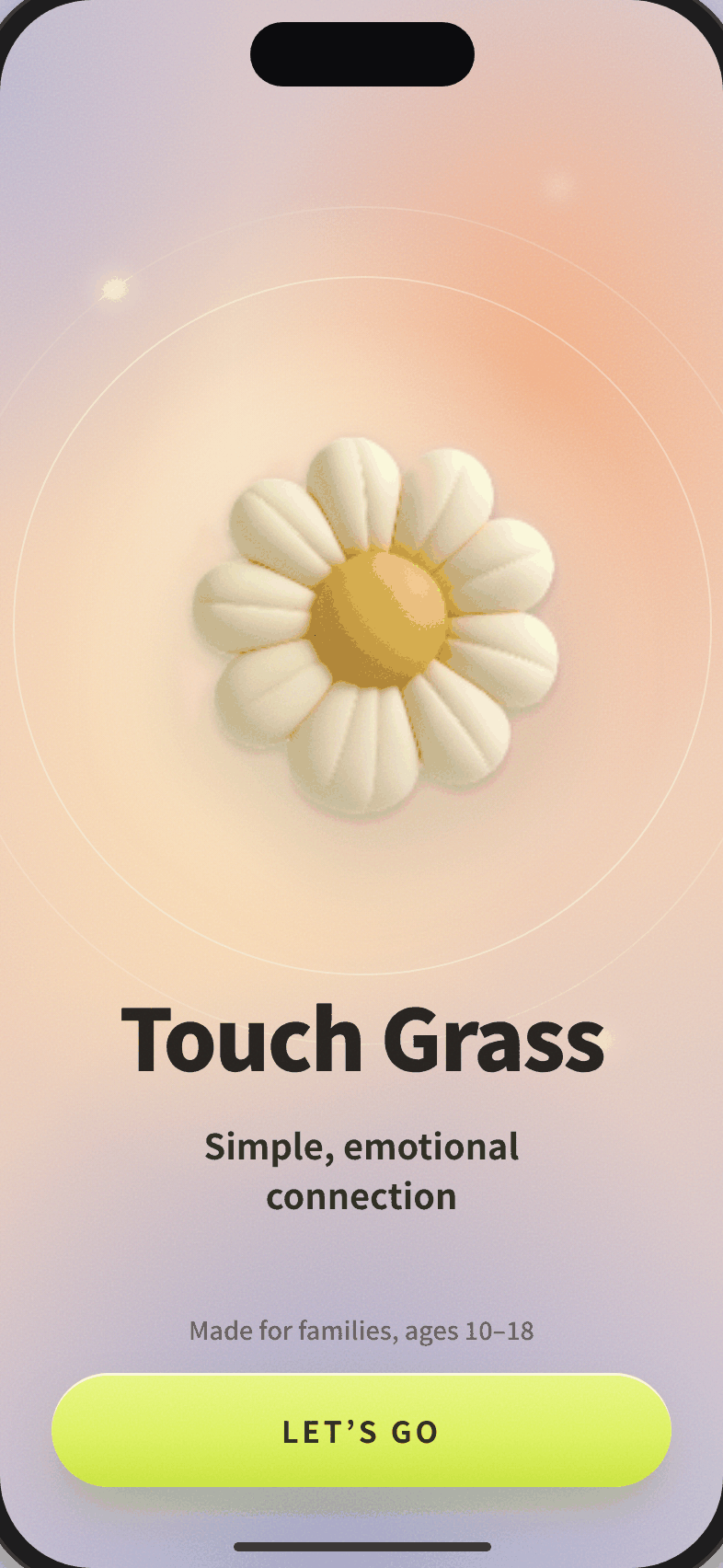
A wellness app for teens (ages 10–18) designed to encourage offline connection, without the dopamine loops. Co-Founder and Head of Product. App Store launch June 2025.
Role
Co-Founder, Head of Product
Year
2024–2025
Platform
iOS (App Store)
Launch
June 2025
Why Touch Grass
I set out to design an app that gently pushes you away from itself. My daughter started kindergarten on Zoom. When school reopened, 5-year-olds weren't allowed to touch. Touch Grass helps kids learn to socialize again and supports parents trying to raise emotionally literate humans.
The challenge
Design a product that encourages behavior change without exploiting dopamine loops. Teens wanted autonomy. Parents wanted oversight. The business goal was a simple, credible MVP that could prove traction with families while staying true to "gentle tech" principles: no streaks, no compulsive notifications, no gamified rewards.
"As a clinical psychologist and a mother of young children in our current digitized times, I am more mindful than ever about our youth's increase in screen time use and decrease in personal interactions, as well as the effects it is having on their health. Children, and parents, need meaningful connections, which will not only foster their social skills but enhance their emotional development."
Claudia R., Child Clinical Psychologist
My role
01
Defined the product vision and roadmap from zero.
02
Designed onboarding, activity discovery, and parental dashboards end to end.
03
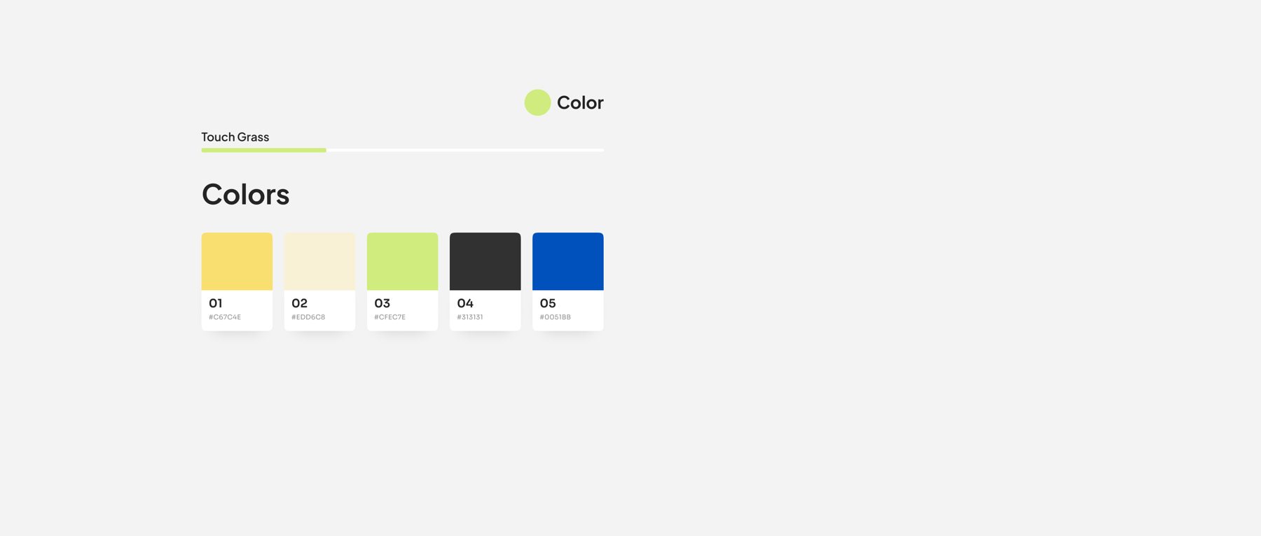
Established brand identity and design principles: gentle nudges, calm aesthetics, no addictive loops.
04
Operationalized the design process and coordinated development through App Store launch.
Design principles
Gentle nudges
Soft tone that encourages self-connection, not comparison or competition.
Movement, not metrics
No steps, no streaks. Just an invitation to go outside.
Aesthetic calm
Visual language that doesn't compete for attention, because that's exactly the problem we were solving.
Core features
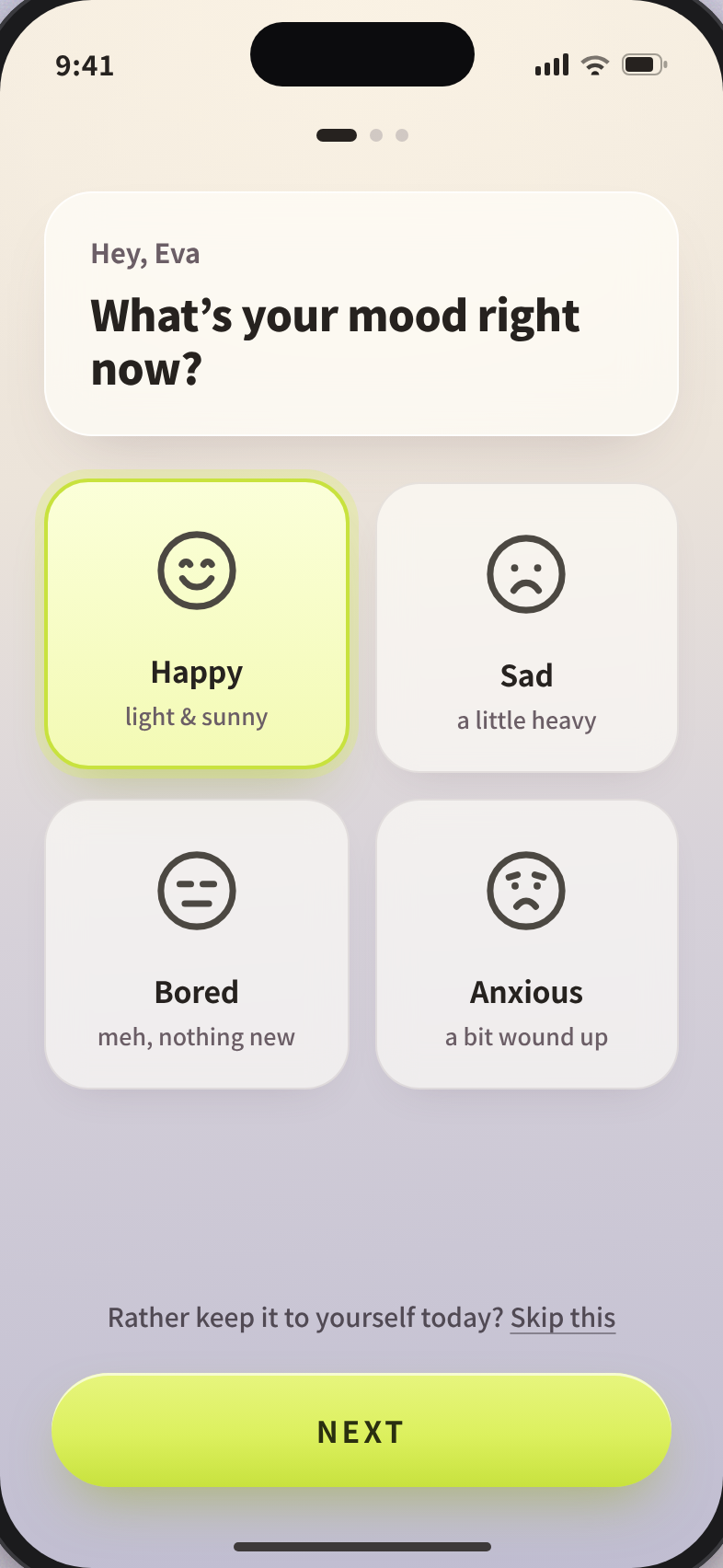
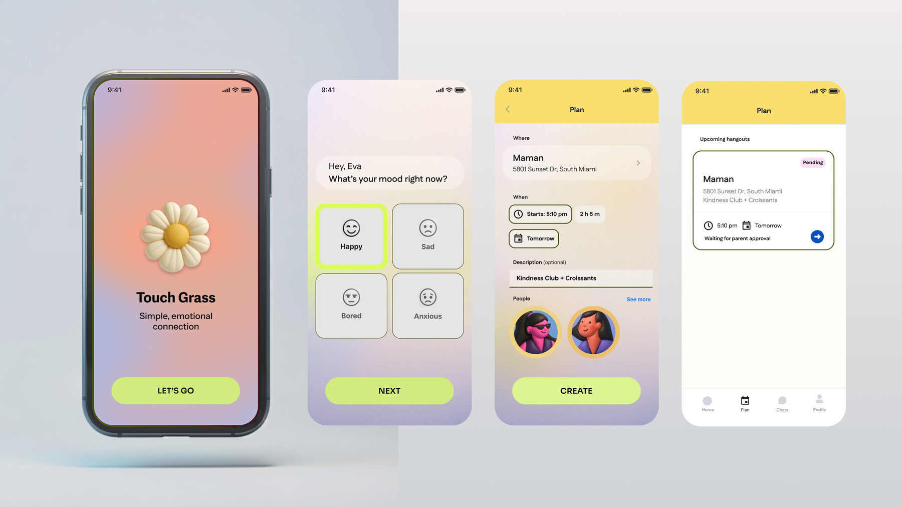
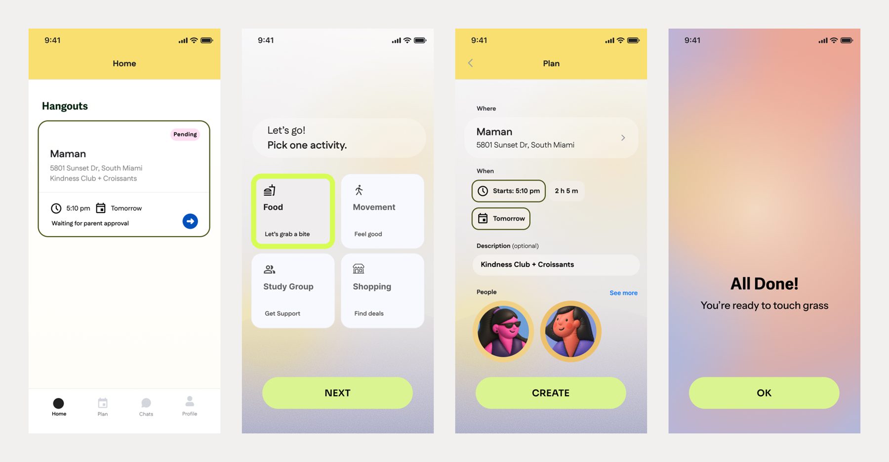
- —Mood logging: a gentle check-in, not a tracker.
- —Event creation: meetups tagged by mood and interest (food, movement, study).
- —Parental approval: oversight built into the flow without surveilling teens.
- —In-app messaging: secure chats with built-in content moderation.
- —Post-event feedback: closing the loop on how going outside actually felt.
Approach
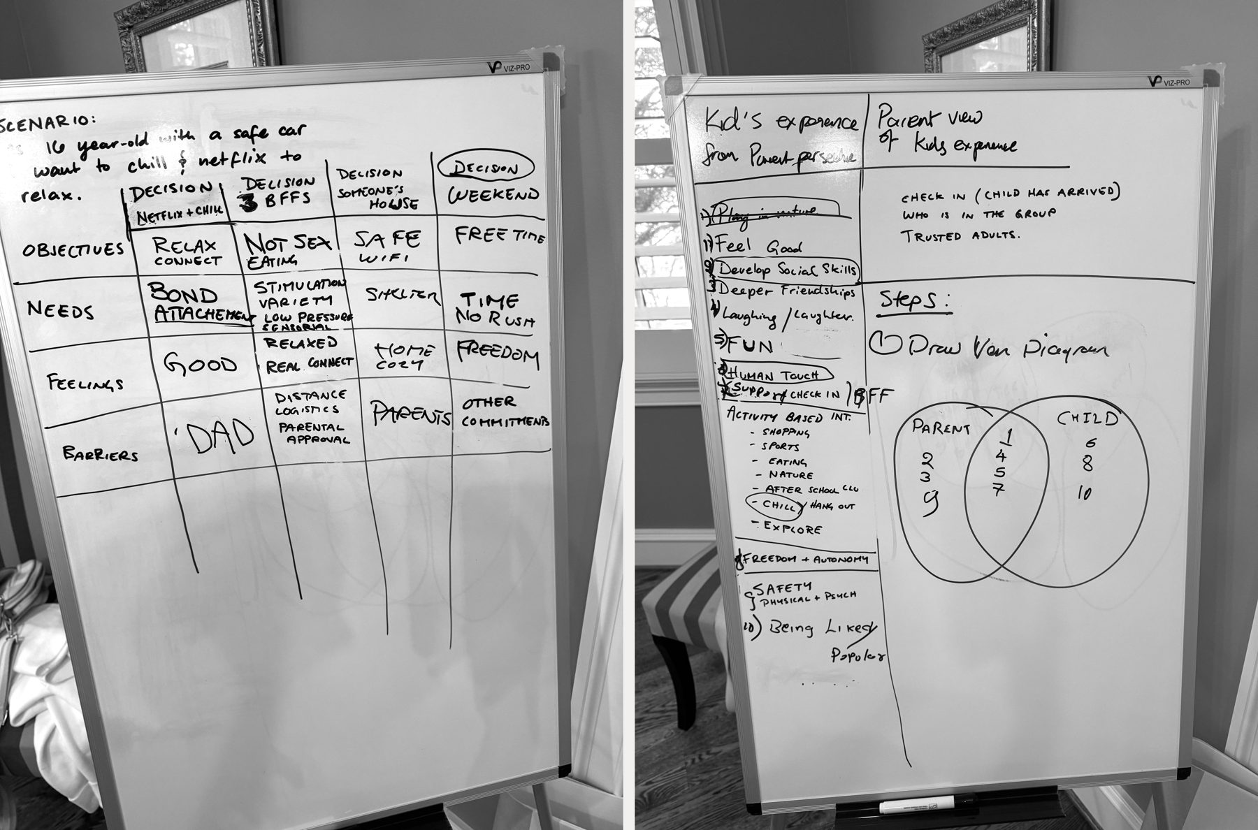
- 01Research & discovery. Parent and teen interviews; competitive analysis of wellness and habit apps.
- 02Product strategy. Defined the "gentle tech" principles: calm nudges, intentional notifications, action over attention.
- 03Design & build. Prototyped onboarding and activity nudges, designed parent dashboards, tested with pilot families.
- 04Launch. Released v1 on the App Store; collected feedback through schools and family beta testers.
Hard decisions
No streaks, even though streaks work
Every retention pattern I knew would have lifted the numbers: streaks, badges, push nudges. I cut all of them. A product whose purpose is to reduce compulsive screen use can’t run on the mechanics that cause it. I chose movement over metrics and accepted slower engagement as the cost of being honest about what the app was for.
Oversight without surveillance
Parents wanted visibility; teens wanted autonomy, and full monitoring would have won the app one audience and lost the other. I designed parent approval as a gate on real-world meetups, not a feed of everything a teen did. Parents got the safety decision that mattered; teens kept a space that was theirs.
A small, credible MVP over the full vision
The vision was large. I scoped v1 down to the core loop, mood check-in, event creation, parent approval, so we could prove families would actually use it before building everything the vision implied. Shipping the smaller, true thing was the harder call and the right one.
Impact
- —Launched on the App Store, June 2025.
- —Early adoption among pilot schools and families in Virginia and DC.
- —Delivered v1: personalized activity nudges, community tracking, parent dashboards.
- —Brand resonated with both audiences: parents (safety, trust) and teens (autonomy, fun).
- —Created the foundation for ongoing research with teens and parents to inform the roadmap.
What I learned
Behavioral design. Designing against addictive patterns is harder than designing for them. Every interaction needs a reason to exist that isn't engagement for its own sake.
Designing for parents and teens at once. Teens wanted autonomy; parents wanted oversight. Navigating that tension shaped nearly every product decision.
From vision to MVP. Translating a big-picture wellness vision into a shippable product under tight constraints. I also learned what it means to be both the product leader and the designer: holding the vision while doing the work, without someone else to catch the gaps.